Students
Review a class project, inspect a shared design, or revisit a lesson away from a computer.
You can stay familiar with the workspace and identify the next task before returning to a larger screen.
tinkercad for studentsMobile access guide
Tinkercad mobile works through a browser rather than a dedicated mobile app. Use this guide to prepare your screen, open the workspace, and decide when a larger display is the better choice.
Keep exploring
These related guides help you move from basic access to a specific project without losing the thread.
Good mobile fits
A phone or tablet can be useful for checking, learning, and making small changes, even when a desktop remains better for precision.
Review a class project, inspect a shared design, or revisit a lesson away from a computer.
You can stay familiar with the workspace and identify the next task before returning to a larger screen.
tinkercad for studentsOpen the interface on a tablet and learn where the canvas, shapes, and controls are placed.
A touch session gives you a low-pressure way to understand the layout before building a complete model.
what is tinkercadCheck dimensions, inspect a simple object, or make a light edit while away from a desk.
You can handle quick project maintenance without treating a phone as a replacement for a full workstation.
tinkercad 3d modelingRead a project, inspect a circuit layout, or review an experiment from a touch device.
Mobile access keeps the learning thread available, while detailed wiring remains easier on a larger display.
tinkercad circuitsOne complete run-through
The mobile route is simplest when you treat the first session as an orientation pass rather than a race to finish a complex project.
Use your phone or tablet browser to reach Tinkercad, then load the design or learning area you need. Keep the device in landscape orientation if portrait mode makes the canvas feel cramped.
Zoom the page to a comfortable level, dismiss browser controls when possible, and use a steady touch rhythm. Tap once to select, then pause before dragging or placing an object.
Start with inspection or one simple edit. Save or verify the result before moving to another control, and switch to a desktop when the task depends on precise placement or many visible panels.
Screen comparison
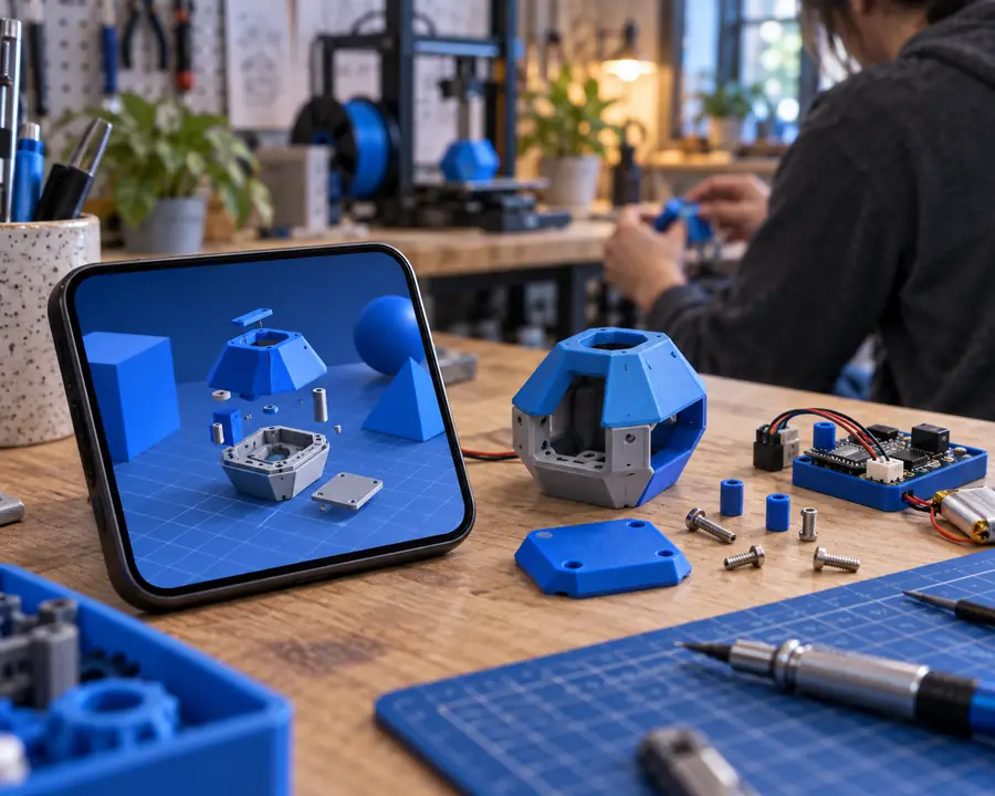
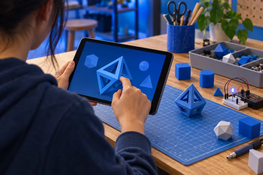
The same browser-based workspace can feel very different depending on available screen area and how much of the canvas remains visible.
Use mobile for access and review; use more screen area when precision matters.
At a glance
The useful distinction is not a special app mode, but how much of the browser workspace your device can comfortably show.
Honest limits
Mobile access is convenient, but convenience should not be confused with full desktop control.
A phone screen can hide the canvas behind browser controls and tool panels, making complex scenes harder to read.
WorkaroundSwitch to a tablet or desktop when several objects and controls must stay visible together.
Touch gestures are less exact than a mouse or trackpad for tiny selections, alignment, and repeated placement.
WorkaroundUse mobile for review and simple edits, then finish precision work on a larger display.
Screen size, zoom behavior, orientation, and browser controls change how much of the workspace is usable.
WorkaroundTry landscape orientation, adjust zoom, and use a current browser with stable connectivity.
The mobile route depends on reaching the web workspace, so an app-store download is not the central access method.
WorkaroundBookmark the browser route for quicker returns and keep your desktop workflow available for larger projects.
Choose your surface
Both surfaces lead to the same web-based destination, but they suit different stages of a project.
Phone or tablet
Desktop or laptop
Phone or tablet
Open Tinkercad in a mobile browser
Desktop or laptop
Open Tinkercad in a desktop browser
Phone or tablet
Limited canvas and controls at one time
Desktop or laptop
More room for the canvas and surrounding tools
Phone or tablet
Touch gestures and on-screen controls
Desktop or laptop
Mouse or trackpad with keyboard support
Phone or tablet
Checking, learning, reviewing, and light edits
Desktop or laptop
Building, arranging, and managing detailed designs
Phone or tablet
Easy to use away from a desk
Desktop or laptop
Usually tied to a larger workstation
Phone or tablet
Suitable for simple selections and changes
Desktop or laptop
Better suited to exact placement and repeated edits
Phone or tablet
Browser access without a dedicated app install
Desktop or laptop
Browser access on a larger computer
Common questions
The short answers below focus on mobile access and whether the service is limited to the web.
Open Tinkercad in a browser on your phone or tablet and load the workspace you need. Use landscape orientation, adjust zoom, and begin with a simple review or edit before attempting a detailed build.
Tinkercad is primarily accessed as a web-based application, so the browser is the main route on both computers and mobile devices. A dedicated native mobile app is not required for opening the workspace.
You can open the web workspace on a phone, but the smaller display may make detailed modeling or circuit work difficult. A tablet or desktop is usually more comfortable when many controls must remain visible.
Yes, a tablet offers the same browser-first approach with more room than a phone for the canvas and controls. It is useful for learning, reviewing, and lighter edits, while precision-heavy work may still benefit from a desktop.